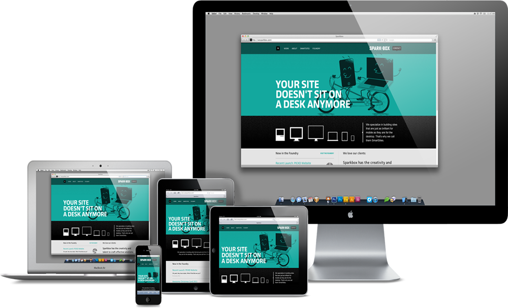
Responsive design
When I started creating this blog, some 40 days ago, I decided to go with a very simple template. First of all because I don't like many bells and whistles. Second, because I know that I don't have the skills to modify complex templates. All these JS libraries and CSS magic things are wonderful, but I leave them to the professionals.
I'm not a professional web designer; I don't even think I could call myself an amateur. So being simple was important to me. Then a couple of weeks later I read that Android surpassed Internet Explorer and being the geek I am, I decided to make my site mobile friendly.
I spent probably too much time trying to locate a template that would be mobile friendly, or responsive, and at the same time be as simple as I wanted it. I failed. Everything was too bloated. Then I decided to try my luck.
The good thing when you have a very simple design, is that changes are easy. If your CSS is some 80 definitions, transforming it into a responsive website is a piece of cake; even if you don't really know much about responsiveness.
I spent a couple of hours researching resources on the internet. I probably took a lot of courage by this one and voila: not even three hours later I have a blog with a responsive design.
It will not win any competitions and it doesn't have any "wow" factor, but certainly does the job for me.